
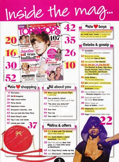
This is the contents page for Top of the Pops magazine. It continues with the bright coloured theme, especially with the colour pink which is suited to the stereotypical target audience of young teenage girls. The contents page is playful and exactly what young girls would like. It's not a boring layout, there is a lot of variation with the font, style and size of text and images. It is also set out with a random template, this creates the illusion that there is more to look at, it is also more appealing to the eye as there is lots of places to look and it doesn't guide the eye to a particular part of the magazine first. The layout of magazines is very important, especially this music magazine where the target audience is young girls who are easily influenced. If the layout was plain, organised and full of words it would immediately draw away the target audiences' attention and they won't be interested. Which is why it's important to have a fun layout and a fun font with bright colours to maintain the attention and attraction.
The presence of attractive males appeals to young girls as they are crazy about the famous male artists and like to read about their funny stories. Also the fact that Top of the Pops magazine has put the main page numbers in the biggest font, is to attract the audience to those specific pages. This way the target audience won't get bored looking through every page to find what they want. Furthermore there are lots of big page numbers to keep the readers excited and to show them that there is a lot to read about that would interest them.

This is the contents page for Billboard magazine. As you can see it's very different to the Top of the Pops magazine, the main reason for this is the difference in target audience. This music magazine is targeted at older teenagers and adults, this is clear from the set up of the magazine. For example it has a clear structure, with neat and consistent fonts and quite neutral colours. Also the images used present people with a range of ages which shows the variety of the target audience and the model in the centre of the image looks quite fashionable showing that the magazine is up to date and readable by a mixture of people.
The contents page on every issue of Billboard magazine has the charts down the left hand side. The chart list is what is associated with Billboard and it's an essential, it shows all the up to date, popular songs, albums and artists. This contents page also includes all the relevant for each page in detail. This again, emphasises the target audience of adults as there is more writing than images, and there is a basic font with basic colours throughout. This isn't a bad thing, it is just what is suited for the variety of people who read this magazine. If Billboard magazine were to style their covers like Top of the Pops do, people would think it's a childish set up with not enough reading.

This is the contents page for Mojo Music Magazine. This is the template for all the contents pages and they all look very similar. The target audience for Mojo magazine is adults, this is clearly shown by the layout of the contents page, there is only one main photo and the rest is text. The text doesn't have a lot of variation, it sticks to a couple of fonts and a couple of sizes. Also the colours used are quite neutral. Again, Mojo magazine don't need to have big text and lots of different colours to draw in their audience of adults. Having a bright theme like Top of the Pops magazine isn't necessary and it would probably again, draw away the attention because it looks 'childish'.
The main subject in the magazine contents page is Florence Welch, from the band 'Florence and the Machine'. The subtitles and the writing all revolve around her. She has red hair which is just like the titles so the contents page carries a theme to it which creates a mild contrast with the neutral background colour.
Also, there is lots of detail under each heading, this is another clue as to who the target audience are. Younger people prefer to look at pictures and adults usually prefer to read blocks of text. If this style of contents page was in Top of the Pops magazine, the target audience would get bored of reading it because it's not exciting, there isn't anything on the page that would jump out at them, and there also isn't any bright colours and fun writing that would suit their moods.


No comments:
Post a Comment