This is an image of a double page spread from a music magazine, and it features Florence Welch from the band 'Florence and the Machine'. The colours on the magazine all revolve around the main subject, the red is a similar shade to Florence's hair which creates a strong constrast with the dull background. The title 'got the love' is lyrics to a song written by Florence and the Machine which is how it links to the image.
On double page spreads, the main subject is never placed in the centre of the magazine, this is because it doesn't create a very good composition, although it's in the middle it would unbalance the image and not create a path for readers to follow. Placing the subject to one side of the magazine and having writing on the other balances out the composition better and generally creates a more interesting layout. It is clear that this magazine isn't for the younger audience because the layout is quite straight forward with little variation in the text. The style of writing also looks quite sophisticated and neat whereas in a magazine targeted at a younger audience there would most likely be 'childlike' writing that has a curly style and big variation with lots of images.
Also Florence is sitting on a cloth with the American flag on it, which links to the title 'USA' in the background. This could suggest that Florence and the Machine have become famous in the USA, also telling me that this is what the article/interview is about.
This double paged spread is from a magazine targeted at younger teenage girls. I know this because of the colours used throughout. There isa common scheme of pink and red which are two very contrasting colours which attracts the eye of young girls. Another reason why it's clear that this magazine is for teenage girls is the variation in writing style and colour. The fonts are funky and a style that would appeal to younger girls, just like the colours. Also there is lots of images on the double pages, all of them are relevant to the topic of the article being N-Dubz. Having lots of images in a magazine, especially with this layout emphasises the target audience as this is what is stereotypically in a magazine like Top of the Pops. Magazines like this like to include key quotes in bigger and brighter writing to get the reader to read this page.
Also including pictures of topless/good looking males makes girls want to read the magazine and get the latest gossip as well as the latest music updates. Top of the Pops appeals to its target audience very well, as well as including information on the latest music tastes, it includes information about the artists themselves which would be in a usual gossip magazine, but by combining the two into one it widens the target audience for this particular magazine.
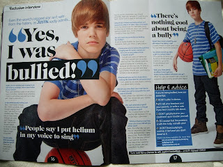
This is another double page spread from a magazine similar to the Top of the Pops one above. This double page spread features Justin Bieber, a very popular worldwide artist which young girls are obsessed with. The fact that he is talking about bullying in this issue of the magazine shows that he goes through the same things as young people today, it also shows that he is just a normal young boy although people look up to him as an inspiring role model, he is really is just like everyone else.
This is a very old issue as Justin Bieber is a lot older now. But the way he is posing and the props he has emphasises again the target audience, he has school books and a basketball which is stereotypically what American boys carry in school.
The main colour used is blue, with some black. As well as being bright and contrasting it is a colour mainly associated with young boys, like Justin Bieber. The purpose of having a white background makes the whole double page spread stand out more because it appears brighter and more appealing for the target audience. This double page spread also includes key quotes said during the interview that are purposely made bigger so that when the reader turns to this page, they can have a brief insight and an idea as to what this section of the magazine is talking about and then be intrigued to read the rest.


No comments:
Post a Comment