Friday 27 December 2013

The Representation of Men and Women in Rap

The rap genre is becoming more and more popular as the years go on, and it seems to be gradually taking over the charts. Rap consists of both male and female artists, however there is a strong dominance of the male sex. This influences the target audience, therefore creating a fan base of mainly males, but this isn't to say that females can't enjoy rap music. There is still a huge number of young females who enjoy this genre just as much as the young males. In the rap industry majority of rap artists are male, for example there is Kendrick Lamar, Tyga, 2 Chainz, Tinie Tempah, Lil Wayne - the list is endless. On the female side of things we have artists like Nicki Minaj, Lil Kim and Rihanna can come under this category, but the amount of female rap artists is very limited. However, this is acceptable in a genre like rap because a lot of the time between 2-5 rappers join up to create a collaboration of their music and taste in one song, which shows to be very popular with the target audience.

The rap genre can be very controversial with audiences who don't like it. This is because rap music is quite sexualised, it's not for very young people as it's not appropriate and this creates an argument about the right/appropriate age to be listening to this type of music. Another argument is that some people think that the lyrics in the songs don't have meaning to them as they just talk about sex and crime. This may be the case for some but certainly not for all, a lot of rappers like to talk about their life experiences in their songs that could hopefully be influential and inspiring to others. Although, another argument is that it doesn't matter what the rappers talk about in their music, it's there to be enjoyed by whoever enjoys it, and I am one of those people.

I think at the moment the rap industry is on it's way up, a lot more songs are already becoming featured in the charts and becoming more and more popular with the audiences who enjoy pop music as now, the two genres are beginning to overlap. Nowadays you will most likely hear a song that has a stereotypical pop chorus and rap verses, and this is how the rap industry have gained a wider audience and therefore are becoming one of the top genres.

The negatives with the rap industry is the fact that the explicit music is available to young children on YouTube and other websites, even radios play this music and although the swear words and inappropriate language is blanked out, the remains of the sentence isn't and it is so easy to tell what the sentence means and before long, young children will be singing it out loud and in my opinion, that is inappropriate and something I think people should work harder on to avoid.

Saturday 21 December 2013

Mood Board


This is my mood board based around the rap genre. As you can see I have included a lot of music magazines from Vibe and from XXL, this is because this is the layout I want to include in my music magazine when I come to make it. I also chose these images as they all have the key colours which I want to have throughout my magazine - red, white and black. Furthermore, I like the covers of these magazines because they feature a main artist on the front, then include more information about other artists inside. For my music magazine I want to also have one main image on the front and then talk about other artists and news on the inside.

With the images of the double pages spreads, I like how there is again, one big photo on one side of the double page and then on the other there is the story or the interview. Because my music magazine will be targeted at older teenagers, I don't need the same layout as somebody who is making a magazine for the pop genre as this type of magazine doesn't need lots of bright colours jumping out at people to attract them over, this is more of a mature way of drawing in the attention of readers.

Thinking of a Concept


Group Analysis of Double Page Spreads


In one of our lessons we were split up into small groups and everybody analysed 3 images of double page spreads from some music magazines. Looking at these double page spreads not only gave me ideas for my own music magazine about what sorts of information to include and what layout to use, but it also enabled me to look at other peoples views and analysis's and incorporate it into my own work, because everyone else's analysis was different to mine in some way which helped my understanding of the double page spreads a little more.

Friday 20 December 2013

Research into different audiences

For each genre of music there is an associated target audience.

Pop

The pop genre carries a target audience of both girls and boys, however mainly young/teenage girls. Women are definitely more dominant in the pop industry and they tower over the male artists, this is one reason why the target audience is mainly young girls. Pop is the most common and wide spread music genre and has an E demographic as mainly students and young people listen to it. The average ages range between 12-24 and majority are females.

Rap

Rap is becoming more and more popular as the years go by and is a genre enjoyed by a huge variety of people. Again, rap has a main demographic of E as it's main target audience is young male students. It mainly focuses on stories about life and crime, which young people can relate to.

Rock

Rock music is a very widespread genre and therefore has a huge variety of audiences and rock also has a lot of sub-genres. However the main target audience associated with rock is older males, with a demographic of C1/2, but with the sub-genres containing indie music, it attracts a younger teenage audience with a mixture of boys and girls.

Country

Country music carries a target audience between 18-54 year olds, meaning that it is a very widespread genre with a big variety of audiences. However it's main audience ranges between 25-45 year olds. People who listen to country music are generally in the top part of the demographic scale, for example the A/B. Over the last 2 years country music has become more popular because of world famous artists like Taylor Swift, who also overlaps in the pop industry.

Reggae

The reggae genre secured it's place in the music industry during the 60s and 70s. The main target audience for reggae were the poor working class Jamaicans, however it soon spread widely throughout the world and is still enjoyed today by a wide range of ages and races.

Thursday 19 December 2013

Music Magazines in a shop

I went to my local corner shop and took images of the music magazines placed along the shelf. As you can see from left to right the featured genres are pop and rock. This tells me that locally, these are the most popular and most listened to genres because this shop lacked variety in music magazines. However the most well known magazines from these genres were on show, for example you can see NME and Top of the Pops magazine.

I have individual images of these magazines which I am going to analyse in further detail below.


This is Shout magazine, it is a pop magazine aimed at young teenage girls. This is clear from the colours and images used on the front cover - pink being a colour stereotypically associated with young girls. Also in the magazine there are make up bits and pieces.

This is a good way of getting the magazine to sell because young girls are so interested in their role models and they are always seeing them with make up on and looking really pretty, and it inspires them to be like them as much as possible. The magazine cover is also packed with lots of information about the content which is intriguing to the young audience, showing them that there is lots to read about, as well as getting the 'goodies'.


This is Top of the Pops magazine, another very popular and well known brand featured on the shelves of shops. Again, the target audience is young/teenage girls. This is obvious from the colours used throughout the cover. There is a consistent theme of pink and the fact that there is One Direction on the front shows an attractive image for young girls. This is also clear because of the layout of the magazine - it's not consistent and it being jumbled up attracts the readers' eye to every part of the magazine all at once which intrigues them to look inside.

Top of the Pops magazine also supply 'goodies' which, as I said above helps the magazine to sell. Some girls only buy the magazine for the 'goodies' inside but at the end of the day this doesn't matter for Top of the Pops because it helps and boosts their sales.


This is a music magazine featuring the genre of Rock. NME is a very popular and well known magazine to a lot of people and it has a target audience of mainly males. NME's main feature colour is red, this could represent the genre of rock because of the power it has, there is also yellow on the cover of this magazine to create a strong contrast to attract the audience and possible new readers.

This is obviously a special issue of NME as it features the 50 best albums and tracks of 2013. I like the idea of including a chart list with lots of information about different artists to keep the readers interested, and I think the more content you can get packed in, the better it is for the younger audiences who are easily distracted.


This is Rock magazine, a very popular music magazine for it's target audience of older men. It is clear that Rock magazine is targeted at older men because of the artists featured on the front. They're middle aged men and it reflects the target audience because older men are less likely to want to read a music magazine about younger rock bands/artists who are knew to the industry, they're going to want to read about there favourite bands/artists who they've grown up with.

This music magazine is very traditional looking with a straight forward and stereotypical layout, this again emphasises the target audience because older people don't need bright colours and interesting layouts to draw them in.

The white title against the black background creates a strong contrast. Even though black and white aren't bright colours they compliment each other where by they help the other one to stand out to the readers.


Overall the Top of the Pops magazine and the NME magazine have influenced me a lot and helped me to be a step closer to figuring out what my music magazine will look like. I like the idea this issue of NME magazine had, where they included a chart list and information about lots of different artists, and I also liked how the Top of the Pops magazine use lots of colours to reflect their target audience and include lots of intriguing snippets of the content on the cover.

Wednesday 18 December 2013

Research into Institutions

This is the logo for Bauer Media, it is a division of the Bauer Media Group which is Europe's largest privately owned publishing group. Bauer Media is known all over the world offering over 300 magazines in 15 countries, as well as online, TV and radio.

Bauer Media joined the group in January 2008 and collectively they employ around 6,400 people. Bauer Media is a multi platform UK-based media group consisting of many companies collected around two main divisions - Magazines and Radio.

Bauer began publishing magazines in the UK with names such as 'Bella' in 1987, and it soon became one of Britain's largest publishers. Bauer then expanded even further in the UK regarding the purchase of Emap Consumer Media and Radio in 2008 meaning that they then became the biggest publishing group in the UK.


NME first started publishing in 1952 as a music magazine in newspaper form, over the years it went through some changes, gradually transforming into a traditional looking magazine. NME was the very first British newspaper to include the top music charts.

NME mainly features rock music but with an overlap of pop, and in 1996 NME first opened up online so that the popular magazine could become even more popular with access from other sources like the Internet, this was better suited to people who didn't want physical copies, or who just didn't have the time to buy the magazine from a local shop.


Immediate Media Company is a company which was established in 2011 by merging together with Origin Publishing.

Magicalia was established in 1999 and is a digital cross-media publisher, it mainly works in retail and also in e-commerce.

BBC Magazines was a commercial subsidiary of BBC. They published magazines such as the 'Radio Times' and 'Country File' for the adultery audience, 'It's Hot' and 'Top of the Pops' were published for teenagers and then educational and pre-school magazines were for an even younger audience. This is a big advantage for BBC Magazines, as they include all demographic audiences and therefore open themselves to a whole variety of different people.

Wednesday 11 December 2013

Analysis of Double Page Spreads

This is an image of a double page spread from a music magazine, and it features Florence Welch from the band 'Florence and the Machine'. The colours on the magazine all revolve around the main subject, the red is a similar shade to Florence's hair which creates a strong constrast with the dull background. The title 'got the love' is lyrics to a song written by Florence and the Machine which is how it links to the image.

On double page spreads, the main subject is never placed in the centre of the magazine, this is because it doesn't create a very good composition, although it's in the middle it would unbalance the image and not create a path for readers to follow. Placing the subject to one side of the magazine and having writing on the other balances out the composition better and generally creates a more interesting layout. It is clear that this magazine isn't for the younger audience because the layout is quite straight forward with little variation in the text. The style of writing also looks quite sophisticated and neat whereas in a magazine targeted at a younger audience there would most likely be 'childlike' writing that has a curly style and big variation with lots of images.

Also Florence is sitting on a cloth with the American flag on it, which links to the title 'USA' in the background. This could suggest that Florence and the Machine have become famous in the USA, also telling me that this is what the article/interview is about.


This double paged spread is from a magazine targeted at younger teenage girls. I know this because of the colours used throughout. There isa common scheme of pink and red which are two very contrasting colours which attracts the eye of young girls. Another reason why it's clear that this magazine is for teenage girls is the variation in writing style and colour. The fonts are funky and a style that would appeal to younger girls, just like the colours. Also there is lots of images on the double pages, all of them are relevant to the topic of the article being N-Dubz. Having lots of images in a magazine, especially with this layout emphasises the target audience as this is what is stereotypically in a magazine like Top of the Pops. Magazines like this like to include key quotes in bigger and brighter writing to get the reader to read this page.

Also including pictures of topless/good looking males makes girls want to read the magazine and get the latest gossip as well as the latest music updates. Top of the Pops appeals to its target audience very well, as well as including information on the latest music tastes, it includes information about the artists themselves which would be in a usual gossip magazine, but by combining the two into one it widens the target audience for this particular magazine.


This is another double page spread from a magazine similar to the Top of the Pops one above. This double page spread features Justin Bieber, a very popular worldwide artist which young girls are obsessed with. The fact that he is talking about bullying in this issue of the magazine shows that he goes through the same things as young people today, it also shows that he is just a normal young boy although people look up to him as an inspiring role model, he is really is just like everyone else.

This is a very old issue as Justin Bieber is a lot older now. But the way he is posing and the props he has emphasises again the target audience, he has school books and a basketball which is stereotypically what American boys carry in school.

The main colour used is blue, with some black. As well as being bright and contrasting it is a colour mainly associated with young boys, like Justin Bieber. The purpose of having a white background makes the whole double page spread stand out more because it appears brighter and more appealing for the target audience. This double page spread also includes key quotes said during the interview that are purposely made bigger so that when the reader turns to this page, they can have a brief insight and an idea as to what this section of the magazine is talking about and then be intrigued to read the rest.

Monday 2 December 2013

Analysis of Contents Pages

This is the contents page for Top of the Pops magazine. It continues with the bright coloured theme, especially with the colour pink which is suited to the stereotypical target audience of young teenage girls. The contents page is playful and exactly what young girls would like. It's not a boring layout, there is a lot of variation with the font, style and size of text and images. It is also set out with a random template, this creates the illusion that there is more to look at, it is also more appealing to the eye as there is lots of places to look and it doesn't guide the eye to a particular part of the magazine first. The layout of magazines is very important, especially this music magazine where the target audience is young girls who are easily influenced. If the layout was plain, organised and full of words it would immediately draw away the target audiences' attention and they won't be interested. Which is why it's important to have a fun layout and a fun font with bright colours to maintain the attention and attraction. 

The presence of attractive males appeals to young girls as they are crazy about the famous male artists and like to read about their funny stories. Also the fact that Top of the Pops magazine has put the main page numbers in the biggest font, is to attract the audience to those specific pages. This way the target audience won't get bored looking through every page to find what they want. Furthermore there are lots of big page numbers to keep the readers excited and to show them that there is a lot to read about that would interest them.

This is the contents page for Billboard magazine. As you can see it's very different to the Top of the Pops magazine, the main reason for this is the difference in target audience. This music magazine is targeted at older teenagers and adults, this is clear from the set up of the magazine. For example it has a clear structure, with neat and consistent fonts and quite neutral colours. Also the images used present people with a range of ages which shows the variety of the target audience and the model in the centre of the image looks quite fashionable showing that the magazine is up to date and readable by a mixture of people.

The contents page on every issue of Billboard magazine has the charts down the left hand side. The chart list is what is associated with Billboard and it's an essential, it shows all the up to date, popular songs, albums and artists. This contents page also includes all the relevant for each page in detail. This again, emphasises the target audience of adults as there is more writing than images, and there is a basic font with basic colours throughout. This isn't a bad thing, it is just what is suited for the variety of people who read this magazine. If Billboard magazine were to style their covers like Top of the Pops do, people would think it's a childish set up with not enough reading.

This is the contents page for Mojo Music Magazine. This is the template for all the contents pages and they all look very similar. The target audience for Mojo magazine is adults, this is clearly shown by the layout of the contents page, there is only one main photo and the rest is text. The text doesn't have a lot of variation, it sticks to a couple of fonts and a couple of sizes. Also the colours used are quite neutral. Again, Mojo magazine don't need to have big text and lots of different colours to draw in their audience of adults. Having a bright theme like Top of the Pops magazine isn't necessary and it would probably again, draw away the attention because it looks 'childish'.

The main subject in the magazine contents page is Florence Welch, from the band 'Florence and the Machine'. The subtitles and the writing all revolve around her. She has red hair which is just like the titles so the contents page carries a theme to it which creates a mild contrast with the neutral background colour.

Also, there is lots of detail under each heading, this is another clue as to who the target audience are. Younger people prefer to look at pictures and adults usually prefer to read blocks of text. If this style of contents page was in Top of the Pops magazine, the target audience would get bored of reading it because it's not exciting, there isn't anything on the page that would jump out at them, and there also isn't any bright colours and fun writing that would suit their moods.

Saturday 30 November 2013

History of Billboard Magazine


The magazine on the left is the very first issue of Billboard magazine, which was published in 1896. However Billboard magazine didn't become very well known until 1936. It is clear that Billboard magazine has gone through some dramatic changes since the establishment. By looking at the first edition I can see that the target audience is probably for people who are a lot older because the colour scheme and imagery used isn't suited to a young audience. Also, it looks like Billboard magazine first came around to be an advertisement base for concerts and fairs etc. and not a magazine about music artists themselves as it says 'A monthly magazine for advertisers'. Over the years Billboard have changed their content and target audience to fit with the times. This was mainly because of the development of the jukebox industry during the 1930s, Billboard started to publish their iconic idea; the music charts. Originally there were only three specific genre-specific charts: Pop, Rhythm & Blues, and Country & Western. In the 1950s it introduced a section covering the television industry, including ratings charts for programs. It continued to carry news of fairs, carnivals, theme parks and other outdoor entertainments until 1961 when these departments were spun off into a new weekly magazine.

At the start of 1961, The Billboard was renamed Billboard Music Week. The publication was now devoted almost entirely to the music industry, with some coverage of coin-operated vending and entertainment machines on its jukebox pages. The title was changed to simply Billboard at the start of 1963. In 2005, the magazine and its web sites were repositioned to provide coverage of all forms of digital and mobile entertainment.

Friday 29 November 2013

Comparison of Music Magazines


These are two very different music magazines aimed at completely different audiences, and this is why I have chosen to compare them as they represent different parts of the music industry. The Top of the Pops magazine on the left has a very stereotypical target audience of young teenage girls and therefore includes stereotypical content such as female role models, like Katy Perry. Also it includes male artists and boys who young girls would consider to be 'hot', for example where it says 'Super Bods!' it shows hot, young boys that would appeal to girls and encourage them to buy the magazine. Also the colours used on the magazine are high in contrast and are 'funky' which is what young teenage girls look for. When I was younger I used to love the contrast of blue and pink and they were my two favourite colours, this is the case for a lot of girls today also.

Top of the Pops magazine is very different to Vibe magazine, mainly because of the target audience. However the content and images are also very different. The genre for Vibe magazine is rap and urban music such as RnB. This would appeal to older teenagers who used to listen to RnB when they were younger, but mainly boys because in general boys listen to more rap music than girls do, but this doesn't mean that this magazine won't appeal to girls. The colours used are quite neutral, like the white with the strong contrast of the red making it attract attention to the target audience. It is clear that the target audience isn't young people because of the content which is mentioned in the feature stories. For example there is 'iconic cars' and 'sex symbols'.

The style of the two magazines are completely different, and the fashion sense in both magazines are also different. The Top of the Pops magazine has singers and artists dressed in pretty, bright clothes which young girls would love to copy and style themselves like. It also has lots of pictures around the outside to get girls excited about reading the content. However Vibe magazine is quite basic and it shows that the chosen target audience don't need over exaggerated colours and fonts to attract them. Even the clothes the featured artist (Kendrick Lamar) is wearing aren't eye catching, just a white shirt with a gold watch, however this creates a contrast and along with this creates a sophisticated and professional image. Also Vibe magazine only has the main feature photo on the front. This is all this magazine needs to get the target audience to pick it up and buy it. However Top of the Pops likes to cram as much content on the front as possible for their target audience to see, so they know the information inside is going to be interesting and worth buying.

Another thing that is completely different in the magazines is the facial expressions of the artists. Katy Perry is smiling which is a stereotypical facial expression for young girls, and it shows that this magazine contains exciting and interesting information. Also Katy Perry is a role model to many young girls and she needs to be shown in a positive way so that the target audience can take away the positive influence. Because Vibe magazine has an older target audience, things like the facial expression and clothing aren't important, this is mainly because older people have usually established who they are and therefore don't become easily influenced by images, like especially young girls do. On the cover of Vibe magazine Kendrick Lamar has a straight facial expression and he isn't expressing any emotion. This may be because of the genre Kendrick Lamar is, he is a rapper who generally speaks about crime and violence and his facial expression, plain clothes and gold watch all play a role in expressing his music.

Friday 15 November 2013

Analysis of Music Magazines

This is Billboard magazine, it is a popular music magazine about the charts with a target audience of older teenagers who enjoy listening to pop music.

The colours on the magazine all revolve around the vibrant red colour of Rihanna's hair. Having a darker background creates a strong contrast with the red hair and automatically draws attention to biggest and most important part of the cover. Red and Yellow are two bright colours which help create this contrast.

Rihanna's gun tattoo relates to the words 'The Re-Reinvention of Rihanna' as it's a James Bond theme writing style. Also 'Re-Re' is related to Rihanna as she refers to herself as 'Ri-Ri'.

Red is the main theme colour on the magazine and it also links to the feature stories listed down the side. For example, 'Bull on Parade'. When you think of a bull, red is the main associated colour, the same with 'Killer App Summit', the word 'Killer' makes you think about the colour red relating to blood. The lighting of this magazine is generally dark with one main bright colour, red. This would be because red is the colour that relates to Rihanna really well and she is the main subject on the cover.

The fact that Rihanna's head is on top of the main title of 'Billboard' could suggest that she is chart topping at the time of this issue release, or she has just released a new song.


This issue of Billboard is featuring Lady Gaga as the main subject. She has bright purple hair which creates a light contrast with the background making the colours very appealing to the target audience.

The title 'Billboard' is in black as it's a very contrasting colour with the neutral purples and this is the part of the magazine which catches the eye of the readers and allows it to draw in attention. The colours used also are fresh and new relating to this new issue. Thirdly the colours are consistent and bright which reflects the pop genre and the only anomalies are the blue and yellow colours in the title 'Billboard'. However on every issue 'Billboard' has two, strong contrasting colours in the 'a' and 'd' of the word. This is  a constant feature for 'Billboard' and is how they make their magazine different from the other music magazines.

Lady Gaga's hair is the main attraction of the magazine cover, it's big, bright and in a unique style. This reflects the sort of person she is because she does lots of weird things that you see and hear about in the media and press. Also Lady Gaga likes to be centre of attention and she likes to do things first, and it's an unusual thing to see somebody with purple hair, especially with it made into a bow. It's not only Lady Gaga's hair that is unique, she also has a very strange fashion sense and wears clothes that nobody else has seen before, just like the outfit she has on in this image.


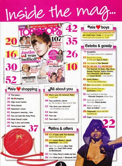
This is Top of the Pops magazine, a magazine which is targeted at an audience of young teenage girls. This is further emphasised by the glittery pink title and the different shades of pink throughout the cover.

TTOP magazine try to include lots of interesting topics to keep their target audience attached. For example one of the feature stories is about One Direction and Justin Bieber. The majority of young teenage girls love listening to pop music and are obsessed with male singers like Justin Bieber and One Direction, so including people like this keeps the magazine relevant to the target audience and therefore makes them want to buy future issues.

The bright pink and the black on the front cover creates a strong contrast which the eye is naturally drawn to, and because these are young, fun colours it attracts the young target audience to it.

This magazine is also very popular with it's target audience because it includes huge pop artists such as Jessie J, Lady Gaga and Rochelle from The Saturdays. These are all role models to young teenage girls who they want to be like and dress like, this is why there is a feature story about dressing like Rochelle for a small amount of money. This magazine also offers advice about the stereotypical things which young teenage girls go through which is another good asset to the magazine encouraging this audience to buy it.


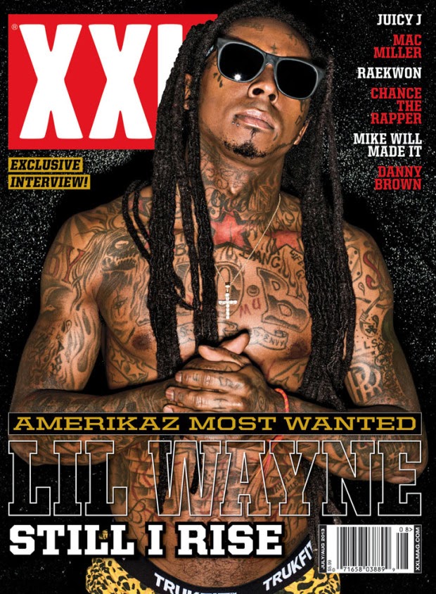
This is XXL magazine which mainly features the rap genre. In this issue Lil Wayne is the main subject on the cover and inside this copy. Again the colours on the magazine are very consistent and black and red reflect and describe rap music very well, deep but passionate.

The colours on the magazine also reflect the genre as they are quite violent and 'in your face' which could be seen as intimidating, a bit like rap is if an outsider listens to this genre.
The intimidation is also emphasised by Lil Wayne himself, he is a controversial artist who a lot of people like but a lot of people are unsure of, his pose also adds to this. However using intimidation isn't to scare people away it's a way of drawing people in because the strong contrasting colours intrigue them, and this isn't seen as intimidating to the target audience, stereotypically older teenage boys. However rap is an open genre which is for whoever wants to listen and be involved in it.

Although the name 'Lil Wayne' is big, it's transparent, this is showing that Lil Wayne is a big world wide artist who doesn't need his name to be highly recognisable. Also 'Still I Rise' is a song by Lil Wayne, but it could also mean that he is rising in the charts and becoming more and more popular.

Wednesday 6 November 2013

My School Magazine


This is my school magazine which I created about life at sixth form. However in this edition there are pages about the lower school.

I decided to base my magazine around sixth form life as it is like a separate school from the younger years and not many people know what happens in sixth form, and in this magazine it has lots of information about what sixth formers do during the day and  just general advice to help anybody with study.

I decided to keep the block colours neutral to allow the writing to draw in the readers' attention, and I think that using red and white does this well.

In my magazine I wanted to include information about house competitions to keep the healthy competitiveness that the school has and give the readers something to talk about with their peers. I also included debates about topics that students would be interested in and have a lot to say about, for example school uniform.

I also think it's a good idea to include things like exam tips because it's a really important thing that everyone goes through at the end of school, and getting help and support with exam stress will really benefit people in the rest of their school life.

Finally, not all the information in the magazine is about school, there is also pictures from prom which people can look at and follow a link to buy online.

Tuesday 5 November 2013

Plan for School Magazine


Analysis of School Magazines


The title of the magazine is "The Kings School", this represents the school as a whole and tells people that the magazine is about the school and what goes on during the day. The magazine is called "The Kings School" because it's the name of the school and it's just simple and convenient to have a name that everyone will know. 

The main subject is a school student and he is standing in front of the school building in his own clothes. When you first look at this magazine, the fact that he's in his own clothes draws you to the cover, and then draws you to the words on the side "UNIFORM the debate it on", this then answers the question as to why he is controversially in his own clothes. The main subject is also standing in front of his own schools building which adds to the relevance of the magazine.

One of the feature stories is about exam stress and tips to help you succeed. This is relevant to the school because this magazine issue was obviously released during exam time and it is something that the older years would want to read to help them through their exams. Another story in the magazine is about the prom and probably includes pictures of people from the prom which is something that I think students would want to see.

The lighting on the front cover is very bright and appealing and the attention is on the main subject in the centre. However the clothes that he is wearing contrast this as they're not bright and appealing. Which tells me that there is interesting content and debates in the magazine. The colour red is used on the sections of the cover which want the most attention, for example "only 80p!" is in red to draw the attention to the customer. On this type of magazine the connotation of red is excitement and a feeling of power, for example with the words 'New!". I think that on this magazine the red represents power because this is written by school students who have the power and freedom to write their view points.

On the front cover there are all the typical codes and conventions for a normal magazine which you would buy in the shop. There is a big title at the top, a barcode, issue number and catchy enticing words to draw you into the magazine. The font used isn't very consistent however I think it represents school and the students in it and emphasises again, the power they have over this magazine. I think that the font used for the bar along the bottom is a good style for school students, it's a swirly interesting font which could reflect the content of the magazine and the creativeness of the students and the school as a whole.


This school magazine is called "FFH" which stands for "Further Faster Higher". This is obviously a sport magazine for a school and it talks about the PE department and all the sports which people have been participating in, and what is happening in the future. The title is very positive, and the fact that it has been abbreviated makes it catchy and easily said. I think they chose this choice of name because it gives off positive vibes and it's short and sweet and represents the success of the school.

The image on the front are of the school netball team who are smiling, this again adds to the positive vibes that the magazine clearly wants to portray. The image appeals to the target audience as they're of similar ages, and maybe they're students' friends on the front which would mean the magazine would definitely appeal to peers.

The feature stories are all about what is going on in the Sports Department and what is going to be happening in the future with sport or anything to do with the school, like trips and clubs. But the school obviously specialises in sport and are very proud of what they do.
I think that this magazine has a good colour scheme which attracts the necessary attention from peers and fellow students, but also it would interest fellow teachers and also parents. I think it's good that the magazine has a wide target audience because it means that everyone is included in the magazine, and the topics and content have a relevance and interest to everybody.

The magazine also includes typical codes and conventions of a normal shop magazine, it has a bold title, slogans and the issue number. It has also put the contents on the front which I think is a good idea because it grabs the audience from the very first glance, they don't have to look inside the magazine to know what it's talking about. I also like the font because it's very consistent and practical, which is something that opens this magazine to a wide target audience. If the style of font was swirly and "child" looking, it would attract the attention away from older people like parents and teachers. But the fact that the writing is practical and consistent means that this magazine is suitable and interesting for anybody.


The title of this magazine is "Harlow High" which I'm guessing is the name of the school. I think they decided to choose this name for their magazine because it's simple and easy to remember and reflects the school, the colours used also represent the school as they're probably the colour theme for the school logo. This makes the magazine look professional as it all ties into the school and represents it in a good way.

The main image on the front of the magazine is a picture of a boy and a girl, this would appeal to the target audience of students as it is their peers and the content inside will probably be relevant to young people. The fact that there is a boy and a girl on the front portrays the mixed school in a positive and friendly way as it shows them getting along and helping each other.

The feature stories are mainly about exam results and upcoming events. The fact that the magazine has the exam results on the front means that they are proud of what they've achieved and again, it portrays the school in a good way as it shows that "Harlow High" is a good place to be, this is also shown by the word "High" and represents the really good exam results and could represent how good the school is as a whole.

This magazines main colour scheme is black and yellow, I think this is because the theme for the school logo is also black and yellow, so it's good that the magazine has kept consistent with the school. I think the colour scheme works as the colours are a contrast and naturally draw in the readers' eye, and once the initial attention is grasped it probably won't be lost. Also the font is very interesting a swirly, which emphasises the fact that the audience is the young students in the school, and the font makes the magazine appeal to them.

This school magazine has lots of codes and conventions just like a shop published magazine. It has a bold, catchy title, a big logo, issue number and date and feature stories. However the only thing that this school magazine doesn't have is a barcode.